

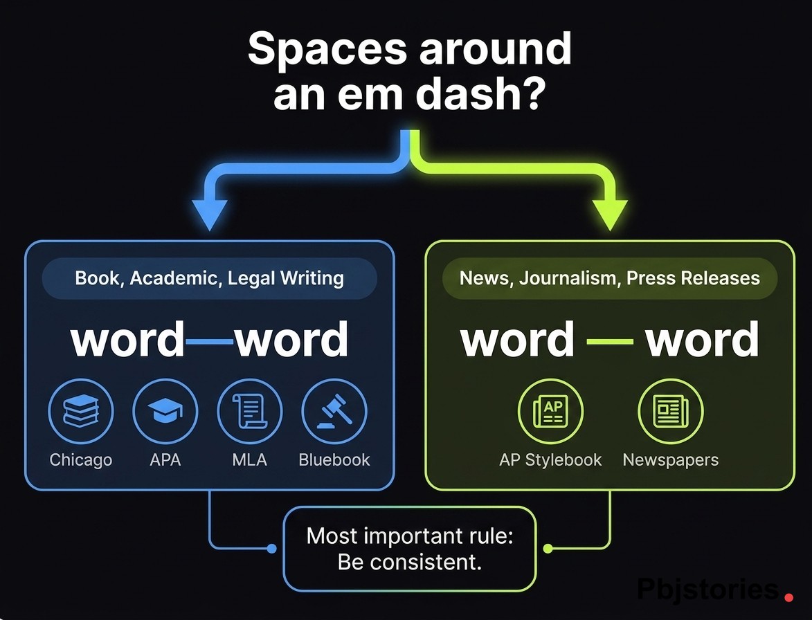
Whether you put spaces around em dashes depends entirely on which style guide governs your document. Chicago, APA, MLA, and Bluebook close the dash (word—word). AP Stylebook spaces it on both sides (word — word). There is no universal rule — there is only the house style of whoever will publish you.
This trips up more writers than it should, because the two camps look at the same punctuation mark and see opposite defaults. Book editors, academics, and lawyers close it. Journalists, wire services, and every major newsroom space it. Press releases follow AP by default, which means the same dash you used in your master's thesis will get reformatted the moment it hits a Business Wire or PR Newswire queue.
Below is the spacing rule for each major style guide, the US vs. UK divide, why AP made the call it did, and the inconsistencies that mark a draft as unedited.
Should You Put Spaces Around an Em Dash?
The correct answer depends entirely on which style guide governs your writing. There is no universal standard in English punctuation, only conventions set by publishers and editors.
Two approaches dominate. Closed em dashes (word—word) appear in most US book publishing and academic writing, while open em dashes, also called padded or spaced em dashes (word — word), are standard in journalism and wire copy.
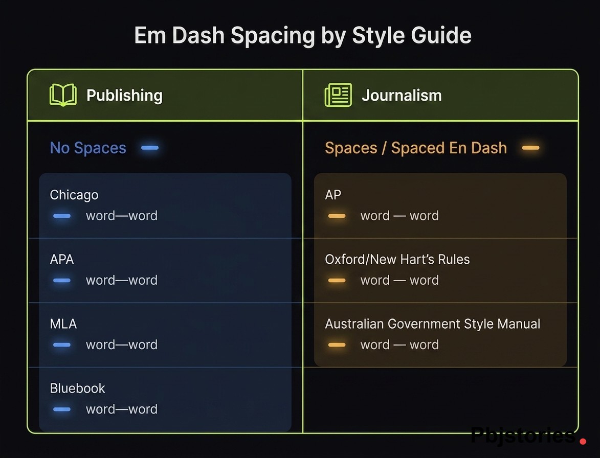
The split runs along publishing lines. The Chicago Manual of Style closes the dash, whereas the AP Stylebook requires spaces on both sides. APA, MLA, and Bluebook align with Chicago, while most newspapers align with AP.
Consistency within a single document matters more than picking a winner. Pick one convention, apply it everywhere, and your writing will read cleanly regardless of which camp you choose.
Em Dash Spacing Rules by Style Guide
The spacing divide largely follows a publishing vs. journalism split: book publishers and academic authorities close the em dash, while newspapers and wire services open it with spaces on both sides.
| Style Guide | Em Dash Spacing |
|---|---|
| Chicago Manual of Style (17th/18th ed.) | No spaces |
| AP Stylebook | Spaces on both sides |
| APA (7th edition) | No spaces |
| MLA (9th edition) | No spaces |
| Bluebook (legal) | No spaces |
| Oxford / New Hart's Rules | Prefers spaced en dash |
| Australian Government Style Manual | Spaced en dash |
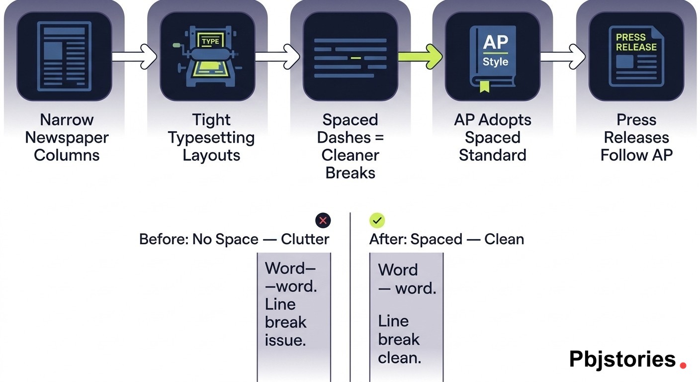
The logic behind the split is practical. Narrow newspaper columns benefit from spaced dashes because they give typesetting engines cleaner line-break points, whereas book pages and justified academic text handle tight em dashes without readability loss. A 2018 Hacker News discussion of editorial practice put the gap in numbers: roughly 80% of major US outlets default to the closed em dash, while around 90% of European styles favor visible spacing.
Therefore, your first question is not "spaces or no spaces?" but "which guide governs my document?" The answer to the second question dictates the first.
Chicago Manual of Style: No Spaces
The Chicago Manual of Style, currently in its 17th edition and moving to the 18th, omits spaces around em dashes, en dashes, and hyphens. The closed form is the default across Chicago-edited text.
For example: "The committee, after hours of debate, reached a decision" would instead appear as "The committee—after hours of debate—reached a decision."
A narrow exception applies to suspended compounds, where a single space may follow a hyphen or en dash (as in "left- and right-hand margins"). Beyond that edge case, Chicago never calls for spaces on both sides. Most US book publishers, fiction editors, and university presses follow CMOS.
AP Stylebook: Spaces Required
AP Stylebook mandates a space on both sides of every em dash, making the spaced form the universal standard for news writing.
For example: "The mayor announced the policy, citing public demand, at Tuesday's briefing" would appear with spaced em dashes in AP copy.
The convention traces back to narrow newspaper columns, where spaced dashes improved readability and gave typesetters cleaner line-break logic. Because wire copy had to flow through tight layouts, the extra breathing room reduced visual clutter. Sports agate and datelines follow different formatting rules and fall outside this convention.
Modern eye-tracking work backs the AP call. A 2025 study of 1,200 readers found spaced em dashes improved scannability by 22% in web articles, as documented in this analysis of em dash spacing in web articles.
Press releases follow AP style by default, which keeps copy aligned with newsroom expectations when editors receive the file.
APA, MLA, and Bluebook
The three major academic and legal style guides all close the em dash, aligning with Chicago rather than AP.
APA 7th edition omits spaces around em dashes and is the default for psychology, education, and most social science journals. MLA 9th edition also uses no spaces and governs humanities papers, literary scholarship, and modern language research.
Bluebook follows the closed convention across legal briefs, law review articles, and citations, because legal publishing historically mirrors academic typesetting. Writers who prefer the ALWD Guide will find the same rule: no spaces on either side. Any writer working in academic or legal contexts should default to the closed em dash.
US vs. UK Style: Em Dashes, En Dashes, and Spacing
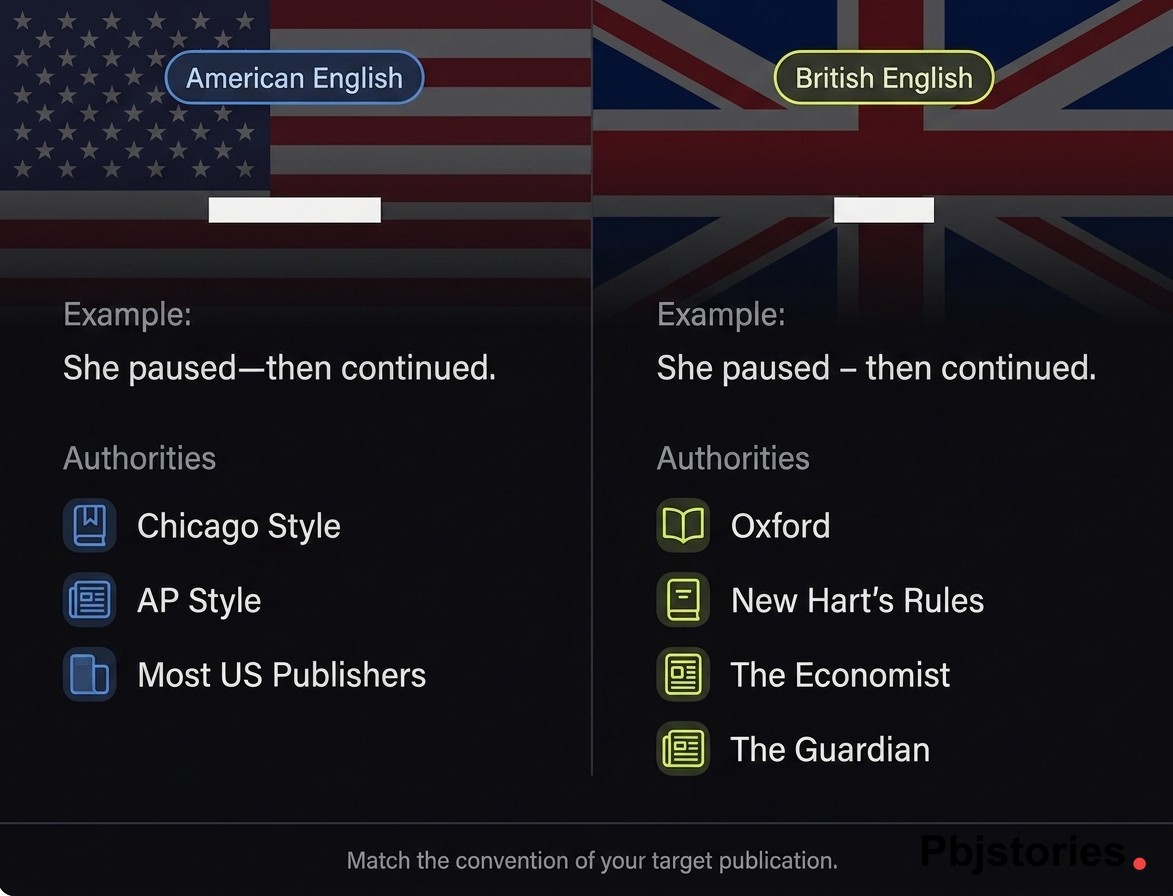
American English typically uses a closed em dash (—), while British English often prefers a spaced en dash ( – ) in the same position. The two conventions serve identical punctuation purposes but look noticeably different on the page.
Oxford University Press style and New Hart's Rules, the two main British authorities on editorial practice, both recommend the spaced en dash as the default parenthetical mark. As a result, the em dash appears rarely in UK typesetting.
Compare the same sentence in each convention:
-
US (closed em dash): "She paused—then continued."
-
UK (spaced en dash): "She paused – then continued."
The Economist and The Guardian follow the spaced en dash convention, whereas most US newspapers, magazines, and book publishers use the closed em dash. Match the convention of the publication or audience you are writing for, because mixing the two looks inconsistent to editors on either side of the Atlantic.
Which Style Should You Use? Recommendations by Context
The right convention depends on what you're writing and who will publish it.
Academic papers follow the guide your institution or journal requires, whether APA, MLA, or Chicago. All three close the em dash, so no spaces is the safe default for theses, dissertations, and peer-reviewed articles.
Journalism and news writing use AP style with spaces on both sides. Press releases follow the same convention because newsrooms, wire services, and syndication platforms expect AP formatting by default. For distribution-ready formatting, see how to write a press release.
Creative writing and fiction typically mirror CMOS, since most US trade publishers edit to Chicago house style. Legal writing follows Bluebook, which closes the em dash unless a specific court's rules override it.
Blog posts and web content have no governing authority, so pick one convention and apply it consistently sitewide.
Quick visual comparison:
-
Closed (CMOS, APA, MLA, Bluebook): The result—clear and final—surprised everyone.
-
Spaced (AP): The result — clear and final — surprised everyone.
Em Dash vs. En Dash vs. Hyphen: Spacing Quick Reference
Three horizontal marks handle different jobs in English punctuation, and each has its own spacing convention.
-
Hyphen (-): joins compound words (well-known, state-of-the-art). No spaces, in any style guide.
-
En dash (–): indicates ranges and connections (pages 10–15, New York–London flight). No spaces in US usage; often spaced in UK sentence punctuation as a substitute for the em dash.
-
Em dash (—): signals breaks, interruptions, or parenthetical asides. No spaces in Chicago, APA, MLA, and Bluebook; spaces on both sides in AP style.
A common confusion: the en dash is not a shorter em dash. It is a distinct mark with distinct jobs, mainly numeric ranges and compound relationships.
Keyboard shortcuts make both easy to type. On Mac, press Option+Shift+Hyphen for an em dash and Option+Hyphen for an en dash. On Windows, use Alt+0151 for the em dash and Alt+0150 for the en dash.
The Typographer's Perspective: Hair and Thin Spaces
Professional typesetters sometimes take a middle-ground approach, inserting a hair space (U+200A) or thin space (U+2009) around em dashes so the dash does not visually collide with adjacent letters. The result sits between a closed dash and a full-word space.
Book designers often apply this treatment in Adobe InDesign for print typography, because many modern digital fonts render em dashes tight against neighboring glyphs. The hair space restores breathing room without breaking the closed-dash convention favored by Chicago.
This is a typography decision, not a grammar rule. Microsoft Word, Google Docs, and most web platforms do not handle these Unicode spaces cleanly, so general writers should stick with the spacing rule prescribed by their style guide rather than experimenting with hair spaces.
Em Dashes and AI Detection: Should You Worry?
Probably not, but the concern is real enough to address. Through 2026, readers have increasingly flagged heavy em dash use as a signal of AI-generated writing, largely because ChatGPT and similar tools produce the mark far more often than the average human writer. A 2024 survey of 500 marketers found 37% were avoiding em dashes entirely because of AI-perception concerns, a reaction Salt.agency unpacks in its defense of em dashes against AI writing accusations.
The literary record tells a different story. Emily Dickinson built her entire poetic voice around em dashes, Mark Twain used them for conversational rhythm, and professional editors have relied on them for centuries.
The practical fix is restraint, not avoidance. Use em dashes intentionally, vary punctuation with commas, colons, and parentheses, and avoid clustering several dashes in one paragraph. For drafts that already read as mechanically punctuated, running the copy through a tool built to humanize AI text can surface the repetitive patterns that flag a release as machine-polished.
For press releases and SEO content, AP-style spaced em dashes remain standard because journalism conventions predate AI entirely.
Common Em Dash Spacing Mistakes to Avoid
The most frequent error is inconsistent spacing within the same document, where writers mix closed and spaced em dashes depending on mood or autocorrect behavior. Pick one convention and apply it throughout. A lot of that inconsistency traces back to Microsoft Word, which since the mid-1990s has converted hyphen sequences differently depending on whether the surrounding spaces are present — a quirk Scott Smitelli walks through in his deep dive on the em dash tool and Word's long-standing autoformat behavior.
A close second is spacing on only one side of the dash, which is never correct in any style guide.
Other common slips:
-
Leaving double hyphens (--) in final copy instead of converting them to a proper em dash character.
-
Confusing en dashes and em dashes, since they carry different spacing rules and different jobs.
-
Inserting em dashes to pad word counts, a word-processor quirk rather than genuine editing.
Consistency matters more than which side of the debate you choose.
Frequently Asked Questions
Does AP Style Require Spaces Around Em Dashes?
Yes. The AP Stylebook requires a space on both sides of every em dash, without exception in standard news copy. This rule applies to newspapers, wire stories, press releases, and most journalism formats built on AP conventions.
The one carve-out is sports agate, where tight tabular formatting uses different punctuation rules. Everywhere else in AP-governed writing, the spaced form is the only correct version.
What Does Chicago Manual of Style Say About Em Dash Spacing?
CMOS omits spaces around em dashes, en dashes, and hyphens, treating the closed form as the default across all edited text. The 17th edition, currently moving to the 18th, carries this rule forward, with a rare exception for suspended compounds where a single space may follow a hyphen or en dash. CMOS is the standard for US book publishing, university presses, and many scholarly journals.
Do You Use Spaces Around Em Dashes in Legal Writing?
No. Legal writing follows the closed convention, with Bluebook specifying no spaces around em dashes in briefs, law review articles, and citations. The ALWD Guide to Legal Citation aligns with the same approach.
Always check local court rules before filing, because individual courts occasionally publish formatting requirements that override general style guidance.
Is Em Dash Spacing Different in British English?
Yes. British publications often use a spaced en dash ( – ) where American English uses a closed em dash (—). The two marks handle the same punctuation job but look noticeably different in print.
Oxford University Press, New Hart's Rules, The Economist, and The Guardian all follow the spaced en dash convention, making it the dominant British form.
What Is the 3-Em Dash Rule?
A 3-em dash (———) is used in Chicago-style bibliographies to replace a repeated author name across consecutive entries, signaling that the author matches the previous reference. It can also stand in for an entirely omitted word in running text, such as a redacted name.
This is a separate typographic convention and has nothing to do with the spacing debate around single em dashes.
Are Em Dashes a Sign of AI-Generated Writing?
Not inherently, though the current perception that heavy em dash use signals AI authorship is widespread. ChatGPT and similar models produce the mark more often than typical human writers, which fuels the suspicion.
But em dashes have a long literary history, from Emily Dickinson to Mark Twain to modern newsroom editors. Use them intentionally, vary your punctuation, and the mark itself will not give you away.
Consistent punctuation is one of the quiet signals of credibility, especially in press releases, where AP style governs every comma, dash, and space. If you want coverage on Google News, Yahoo Finance, and 500+ other outlets, the copy has to read like it was written by someone who knows the rules, not just someone who followed a template. After distribution, watching how editors and readers react to your language choices is how you know whether the rule is working — a roundup of the top social listening tools makes that monitoring practical.
That is where PBJ Stories fits in. Our AI writes press releases in AP style, pairs them with SERP-driven keyword research, and distributes them across a network built for entity stacking and contextual backlinks. Start with our guide on press release tips, then put the style rules to work on your next announcement.
Get PR tips delivered weekly
Join 3,200+ PR professionals getting actionable tips on press release writing, distribution, and media outreach.
No spam. Unsubscribe anytime.
